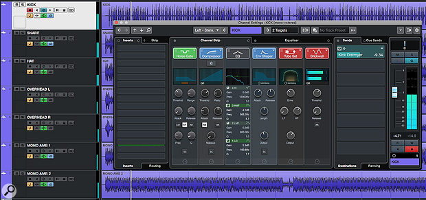
 The Channel Settings window provides a flexible and efficient environment for many basic mix processing tasks.
Could Cubase 10's Channel Settings window become your go-to mixing tool?
Cubase's Channel Strip has the potential to make mixing much more efficient. Indeed, the same concept has translated fairly well from its hardware origins into most modern DAWs now. But when screen space is at a premium some implementations can require considerable screen real-estate — and while the collapsible Rack system in Cubase's MixConsole is brilliant in so many respects, accessing all the controls for each channel can entail a lot of opening/closing of Racks or scrolling up/down.
A small-screen-friendly alternative is to build your workflow around the Channel Settings window. Sure, you can only display controls for one channel at once, but this window makes the complete Channel Strip's controls available in a very easy-to-use format. And with the useful refinements Steinberg made to the operation of the Channel Settings window in Cubase 10, you really should consider putting it at the heart of your mixing workflow.
Channel Guide
The Channel Settings window can be opened for the currently selected track/channel by clicking on the 'e' button in the Project window's Track List or in the MixConsole, and it gives you access to the full control set that's found in the MixConsole — but in a larger, easier to use GUI.
As in previous versions, the contents of the MixConsole's EQ and Channel Strip Racks dominate the central portion of the display, but in v10 Steinberg made some worthwhile tweaks to what's possible here. For example, the UI was improved to offer better access to the core controls of each module, the visual feedback/metering was revamped and, while the EQ section could already be viewed in an expanded form via the Equalizer tab, you can now do that for the Compression section too (via a further 'e' button). The Channel Strip tab now includes a compact version of the EQ section in situ, and you can drag and drop to change the order of the various modules in the signal flow, which makes it much easier to see and configure your preferred processing chain.
Published February 2020
No comments:
Post a Comment